Author Topic: Design nostalgia e fluidez com modernidade  (Read 1686 times)

MISAEL JUNIO DE OLIVEIRA

  • Newbie
  • *
  • Posts: 8
  • Karma: +0/-0
    • View Profile
Design nostalgia e fluidez com modernidade
« on: January 17, 2023, 02:16:22 AM »
Hello! I'd like to share an idea of a theme I'm working on. It has a lot of animations and I'm finding it difficult to make everything smooth and without stopping the menu transition.

As soon as I overcome it, I share it with everyone. Until then, I would like your feedback. Any suggestions for changes are appreciated.

Below we have menu 0 with the choice of systems
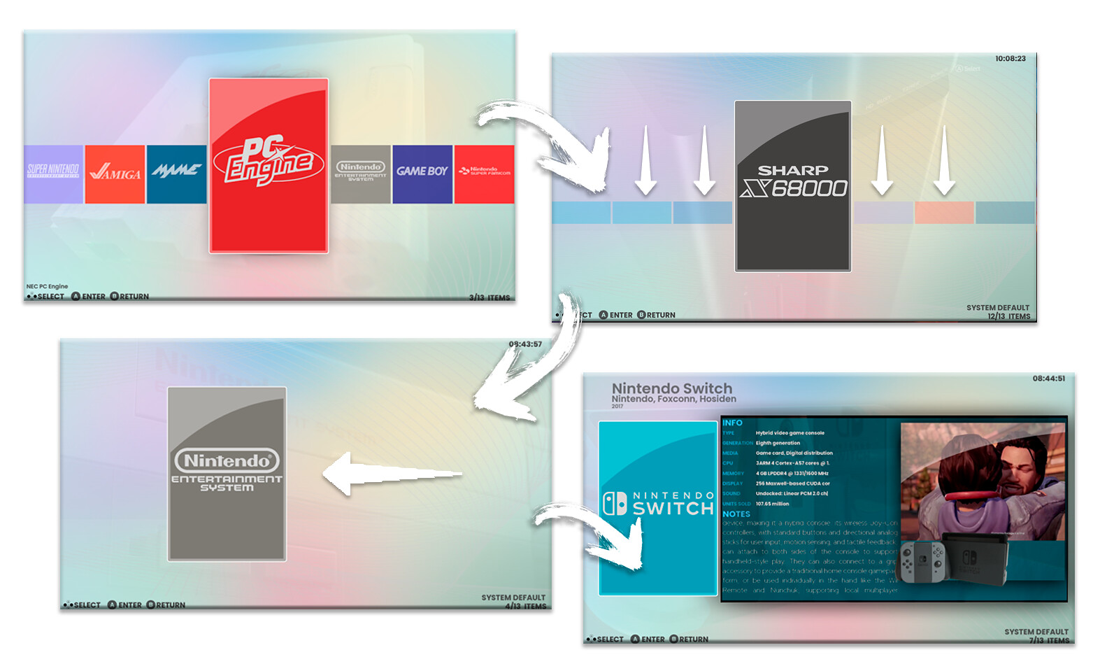
Prancheta 1 by misael oliveira, no Flickr
The menu starts with the flayer using the system colors and then it goes to the left giving space to the information in a frame with the video.

in menu 1 i made many animations to relocate all the elements on the screen.
Prancheta 2 by misael oliveira, no Flickr
https://uploaddeimagens.com.br/imagens/5f83_7U

An important part of the theme's ambience is that it will have a menu song for menu 0 and another theme song per system.

the idea here is to offer a design composition that has nostalgia, a referential look with the system's identity and fluidity with modernity. It is a work in progress I hope to complete and share.
**I'm still thinking about the name.
« Last Edit: January 17, 2023, 02:28:27 AM by MISAEL JUNIO DE OLIVEIRA »

sonkers

  • Newbie
  • *
  • Posts: 31
  • Karma: +0/-0
    • View Profile
Re: Design nostalgia e fluidez com modernidade
« Reply #1 on: July 04, 2023, 10:23:24 AM »
Hello! I'd like to share an idea of a theme I'm working on. It has a lot of animations and I'm finding it difficult to make everything smooth and without stopping the menu transition.

As soon as I overcome it, I share it with everyone. Until then, I would like your feedback. Any suggestions for changes are appreciated.

Below we have menu 0 with the choice of systems
Prancheta 1 by misael oliveira, no Flickr
The menu starts with the flayer using the system colors and then it goes to the left giving space to the information in a frame with the video.

in menu 1 i made many animations to relocate all the elements on the screen.
Prancheta 2 by misael oliveira, no Flickr
https://uploaddeimagens.com.br/imagens/5f83_7U

An important part of the theme's ambience is that it will have a menu song for menu 0 and another theme song per system.

the idea here is to offer a design composition that has nostalgia, a referential look with the system's identity and fluidity with modernity. It is a work in progress I hope to complete and share.
**I'm still thinking about the name.

Simples e funcional
Simple and functional